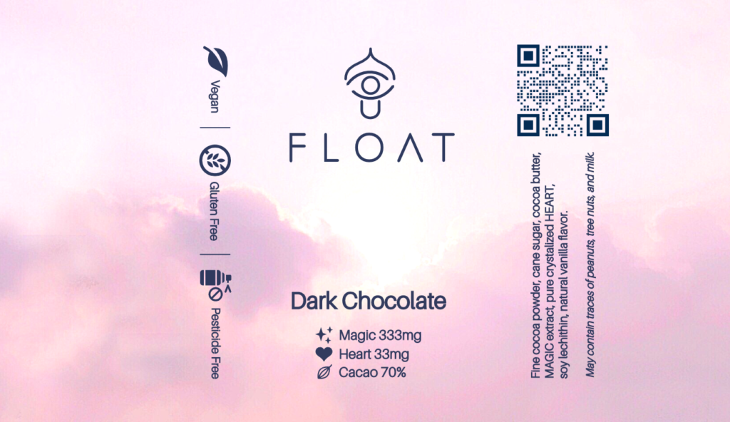
Client: FLOAT Microdose
Industry: Medicine
Location: USA
Job: Packaging Label / Logo
Tools Used: Photoshop / Illustrator
Creating a minimalist logo and labels for a microdose chocolate firm required a seamless integration of simplicity and functionality. The challenge was to convey the brand’s essence while adhering to regulations and maintaining visual appeal.
The minimalist logo served as the foundation, embodying the brand’s identity with clean lines and subtle symbolism. Integrating this logo into the label design involved careful consideration of layout, color, and typography to ensure a cohesive aesthetic.The label design, centered around the logo, conveyed essential product information while maintaining a minimalist and sophisticated look. Simplifying complex details into concise messaging allowed the label to effectively communicate the product’s benefits. Overall, the combined logo and label design captured the essence of the microdose chocolate firm with elegance and clarity, distinguishing the brand while instilling trust among consumers.